Case Study
Turning an agency's custom commerce builds into a scalable, merchant friendly SaaS platform.
Challenge
Pack started as an agency, building fully custom headless commerce sites for brands like Cuts and Vuori. That work was good because it was custom: a small team hand-building one storefront at a time, solving each brand's problems directly.
After closing their seed round, Pack needed to become a product. The same team, the same expertise, but now serving hundreds of merchants instead of a handful of clients. That's a harder design problem than it sounds like. The instincts that make one-off custom work great don't automatically translate into something a stranger can pick up and use without you standing over their shoulder.
I led design on this transition, working directly with Pack's product and engineering team, including CEO Cory Cummings, to define what "productized" actually meant for this business.
Approach
We started with customer interviews, not screens. My team and I talked to merchants who'd tried other headless platforms, to learn where they actually got stuck rather than where we assumed they would. Three patterns showed up fast: onboarding took too long, merchandising tools felt bolted onto the commerce infrastructure instead of built for it, and every customizer on the market asked marketers to think like developers.
That research drove one of the harder calls on the project: build less, but build it right. Instead of chasing feature parity with every competitor, we prioritized the handful of workflows that would decide whether someone succeeded in their first week on the platform. Everything else could wait.
From there, we ran the rhythm of a small, fast-moving design team: sketches into clickable prototypes, testing rough ideas with Pack's team before committing engineering time, then refining based on what we learned.
Solution
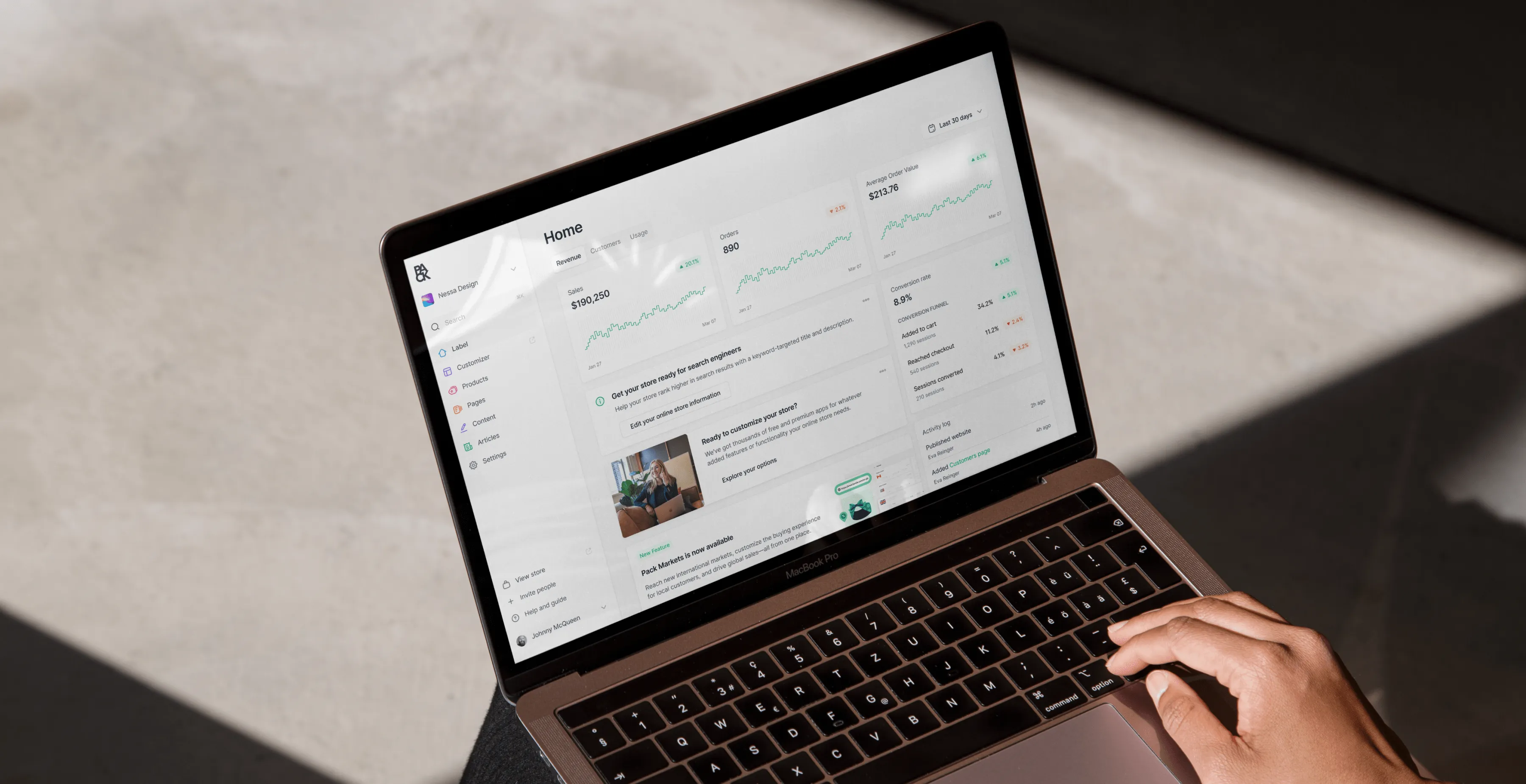
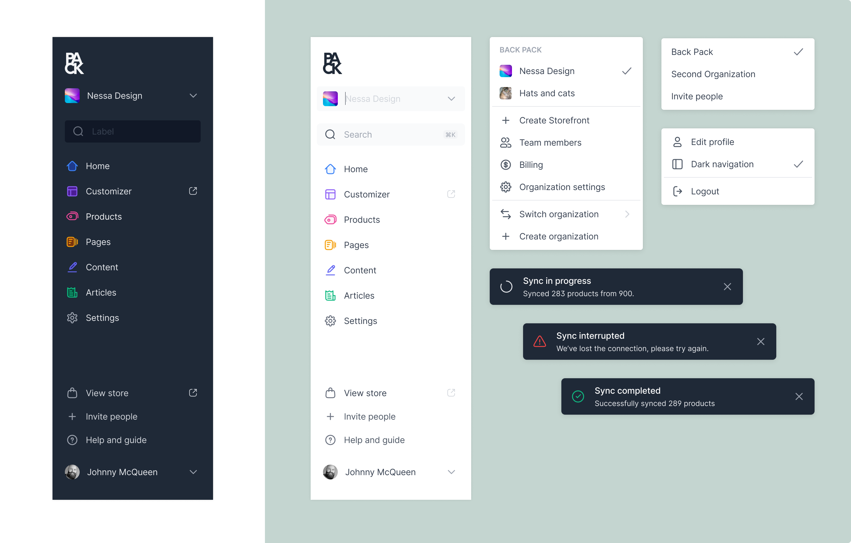
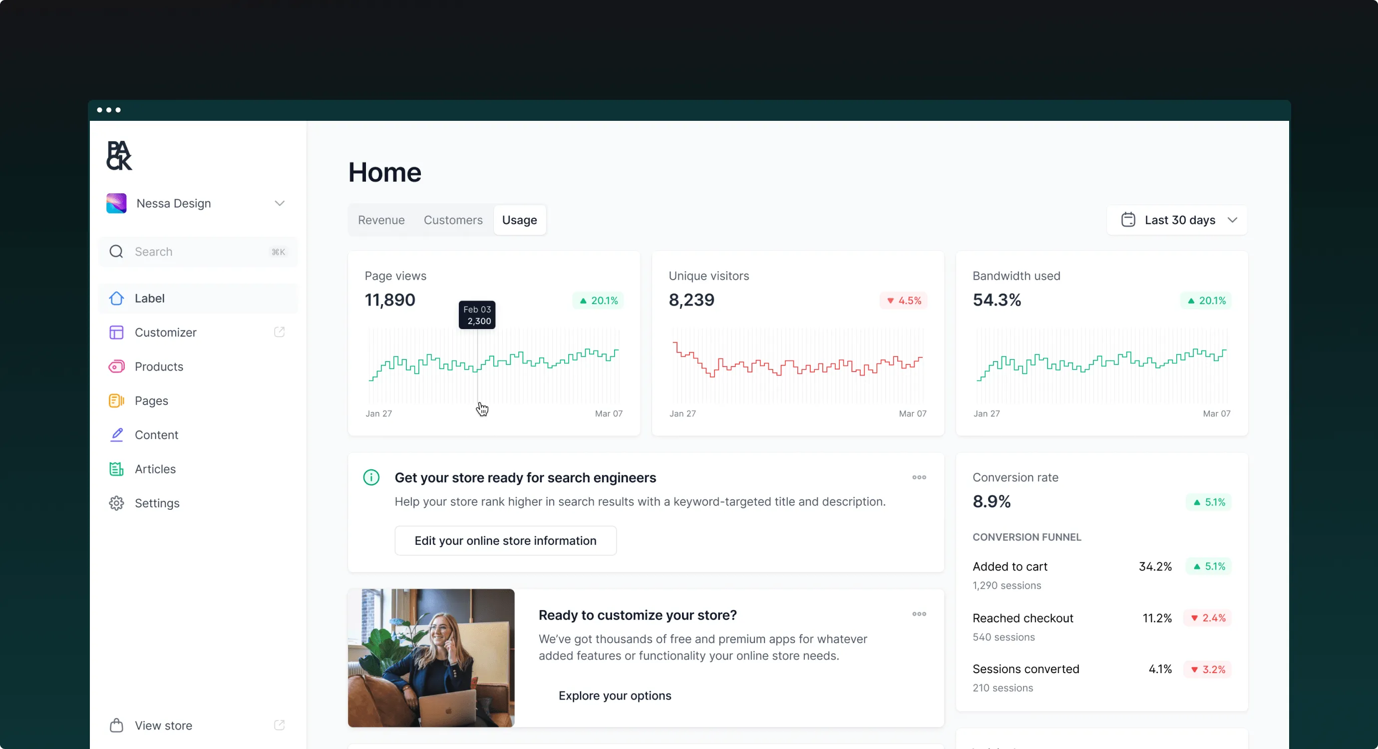
Store owners needed one place to understand how their storefront was actually performing: revenue, traffic, conversion, site speed. Instead of a wall of charts, we organized the dashboard around what a merchant would actually want to check on a given day. A sidebar carries across multiple storefronts, so managing more than one store never feels like starting from scratch.
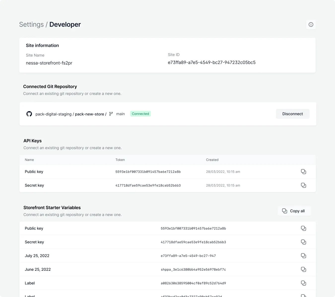
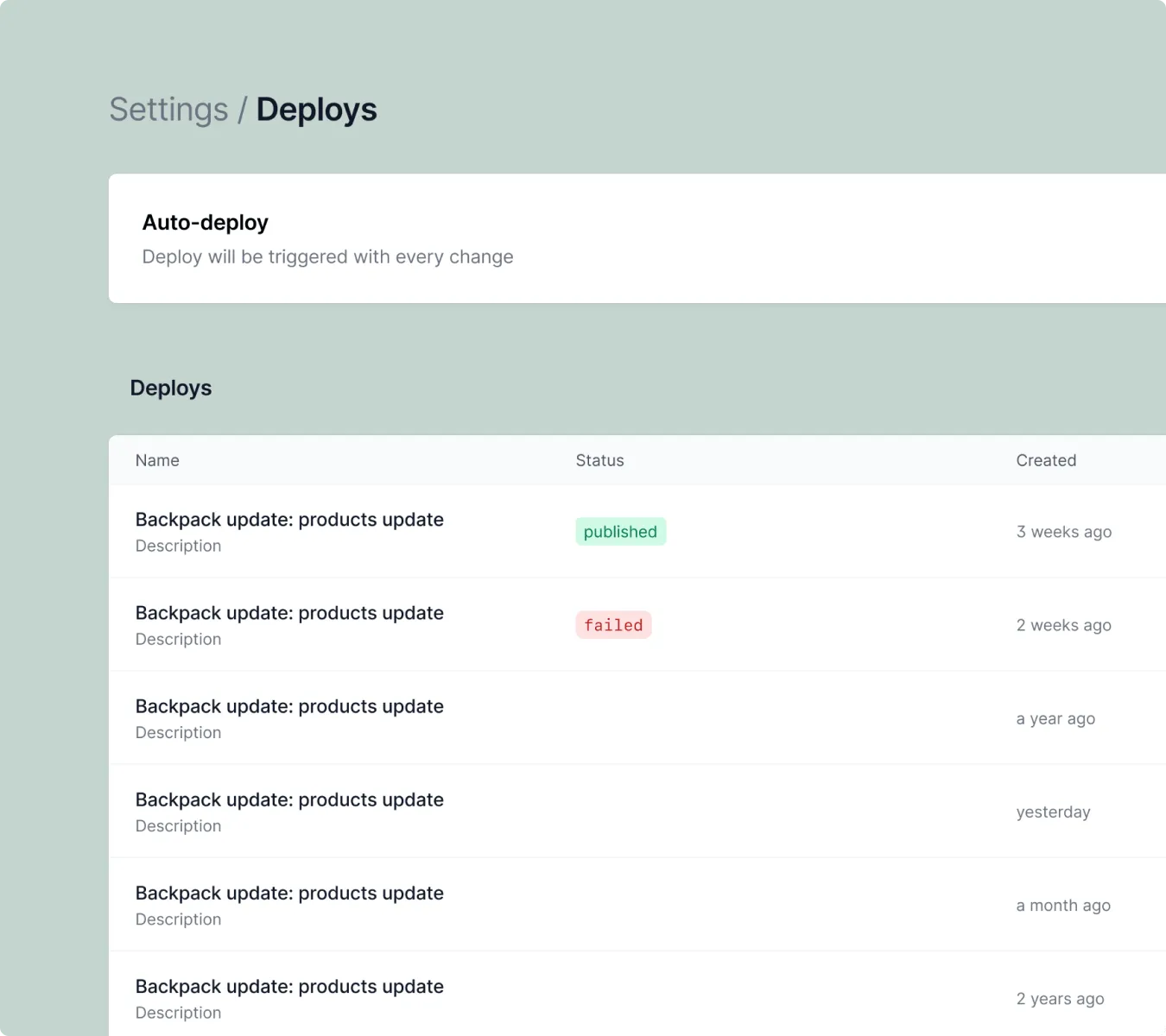
Modern headless builds mean wrangling a pile of apps just to get started. We stripped the setup down so developers could plug into Git with their own API keys and start building without an opinionated workflow forced on them, with real visibility into deploys and status instead of a black box.
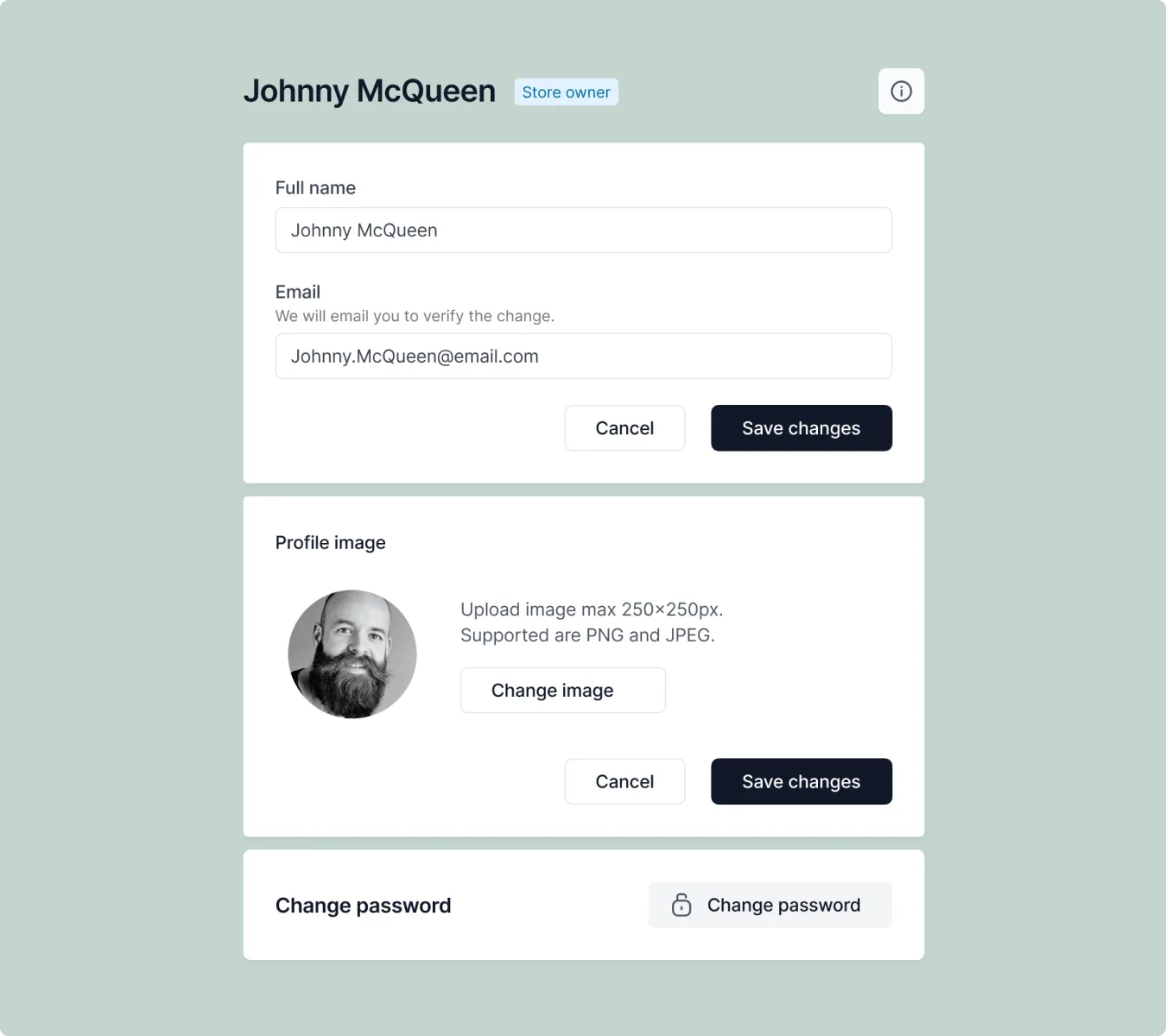
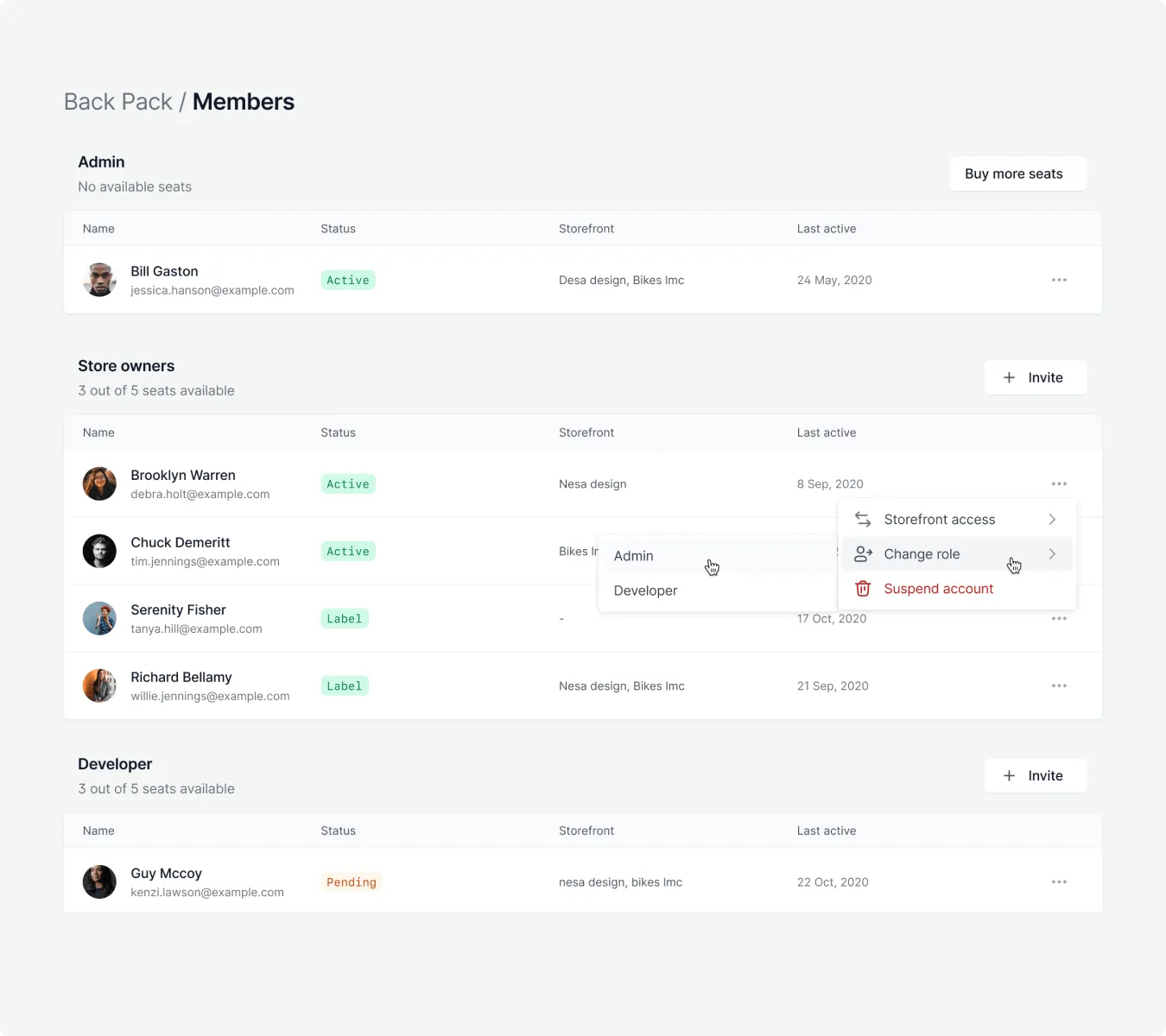
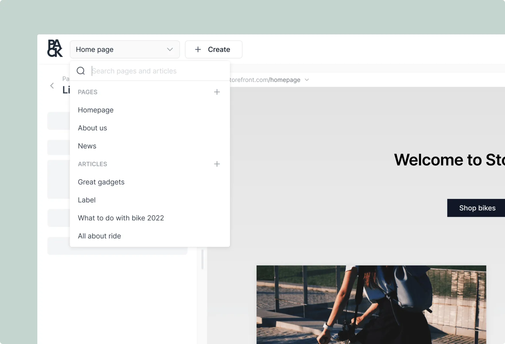
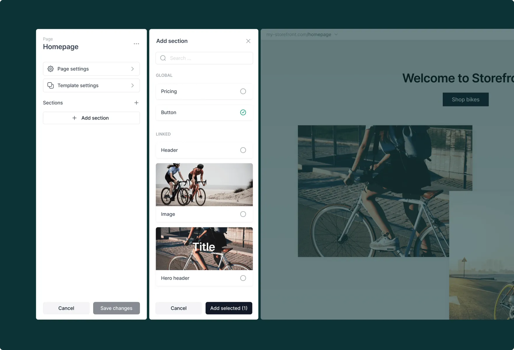
Most WYSIWYG site builders make you choose between flexibility and simplicity, and usually fail at both. We rebuilt the customizer around a sidebar that slides out over a live preview of the actual storefront, so a marketer edits the real page, not an abstraction of it. Every component, banners, product carousels, video modules, rich text, was built to the same global system, so swapping one out never breaks the page around it.
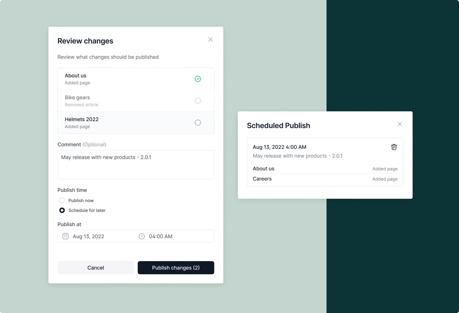
The goal was letting a marketer launch a new landing page or run an A/B test without pulling in a developer. That's the actual measure of whether a customizer works.
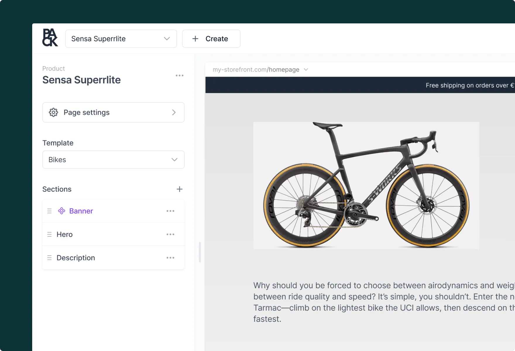
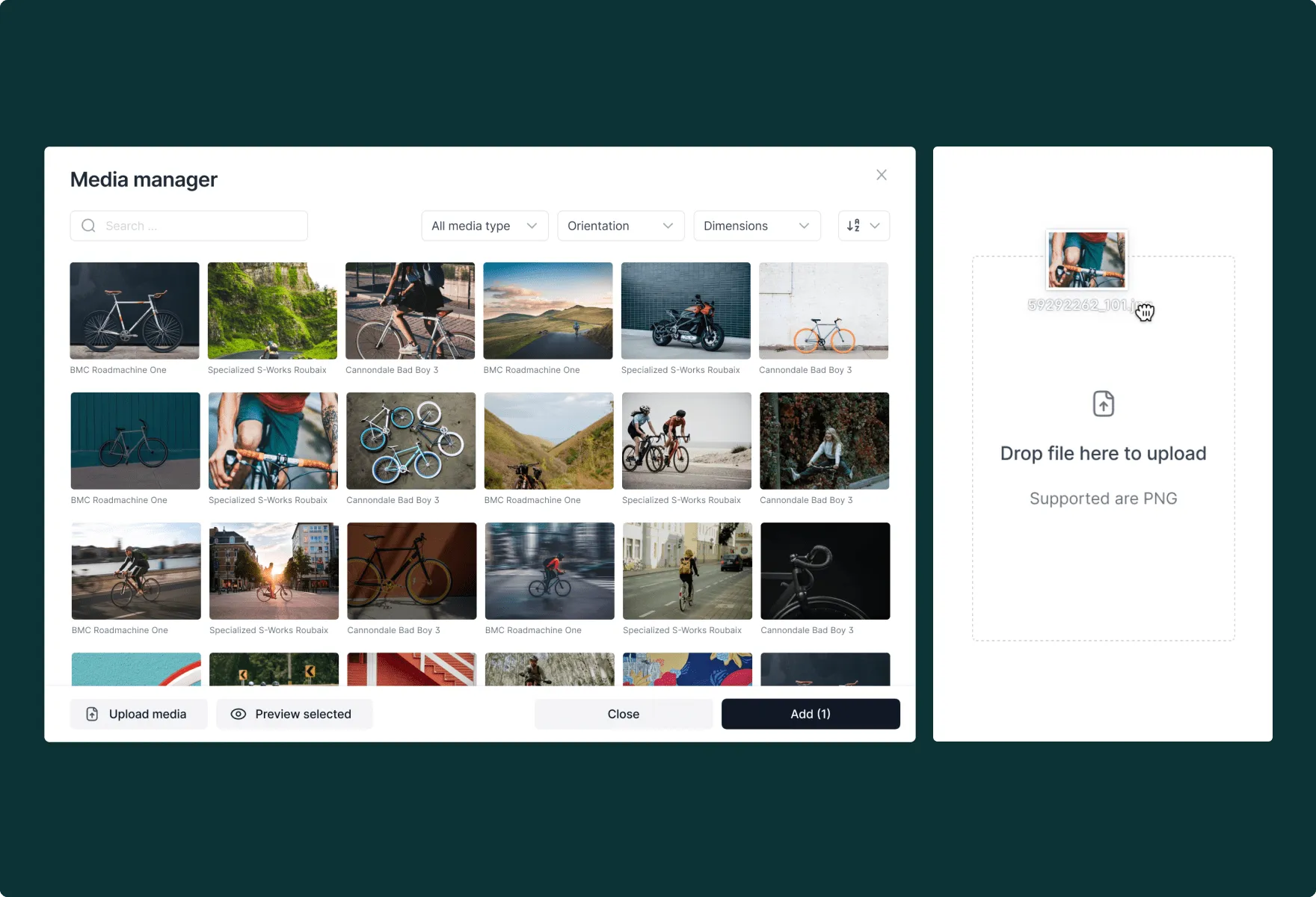
Headless builds have a reputation for clunky merchandising, mostly because commerce infrastructure and merchandising tools tend to get designed separately and bolted together after the fact. We redesigned this so merchants could build product bundles and collections through intelligent, attribute-based grouping instead of manual, one-by-one setup. It's a small change with a large effect: what used to take a spreadsheet and a developer now takes a few clicks.
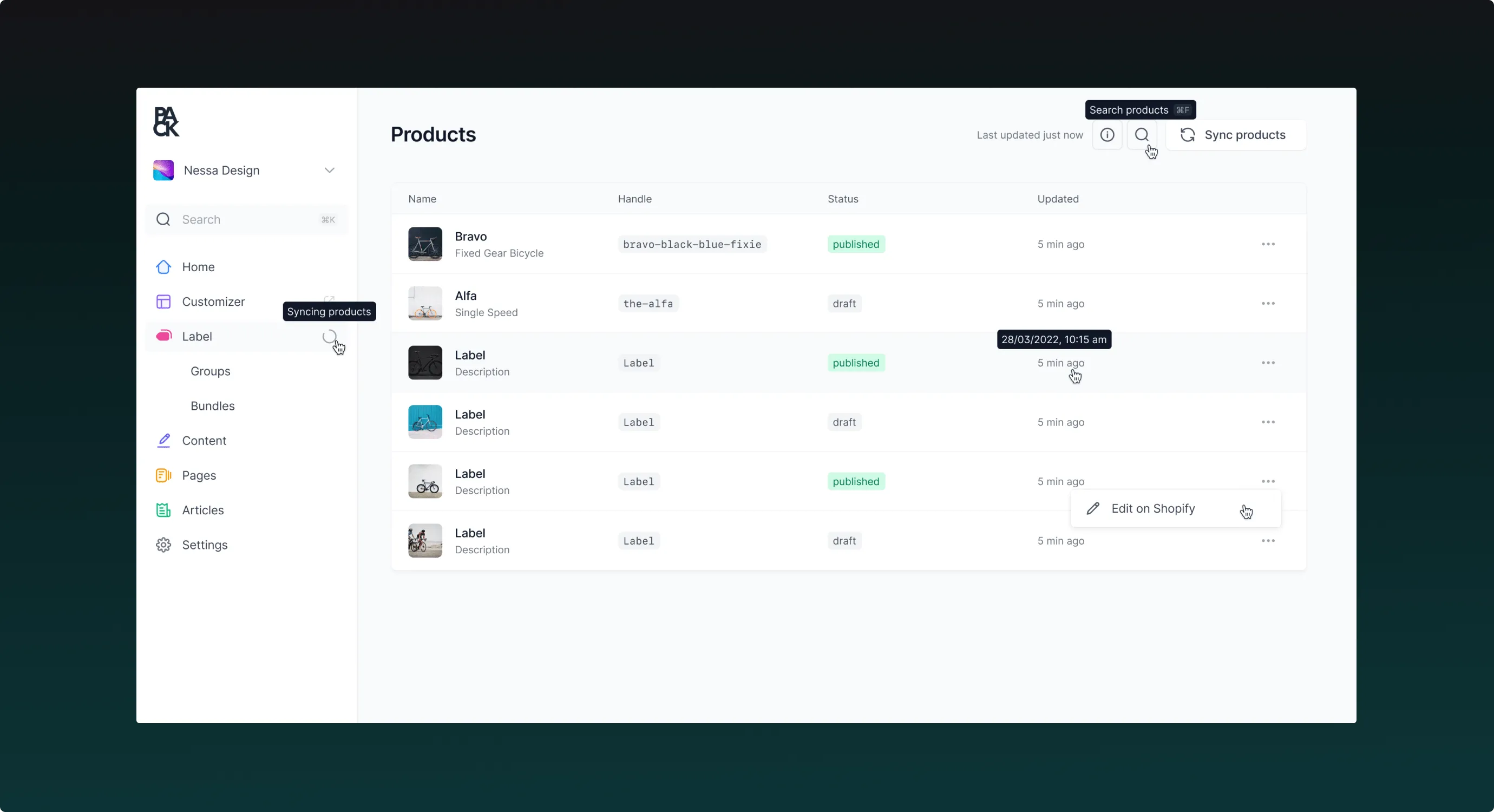
5. The Design System
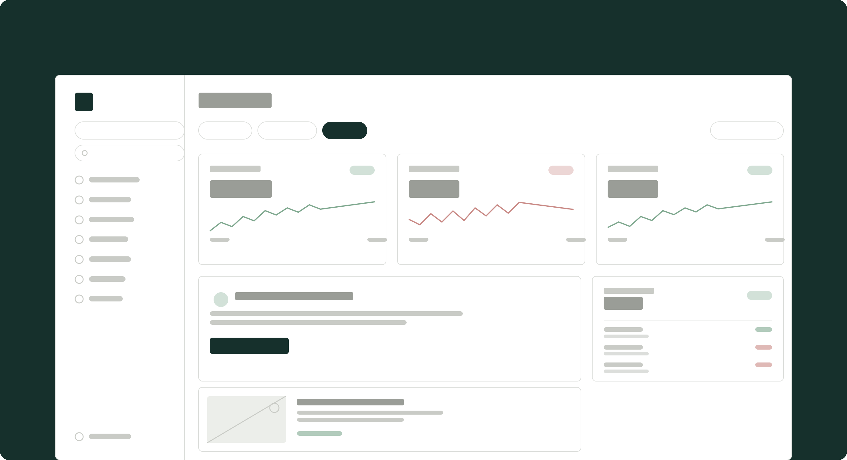
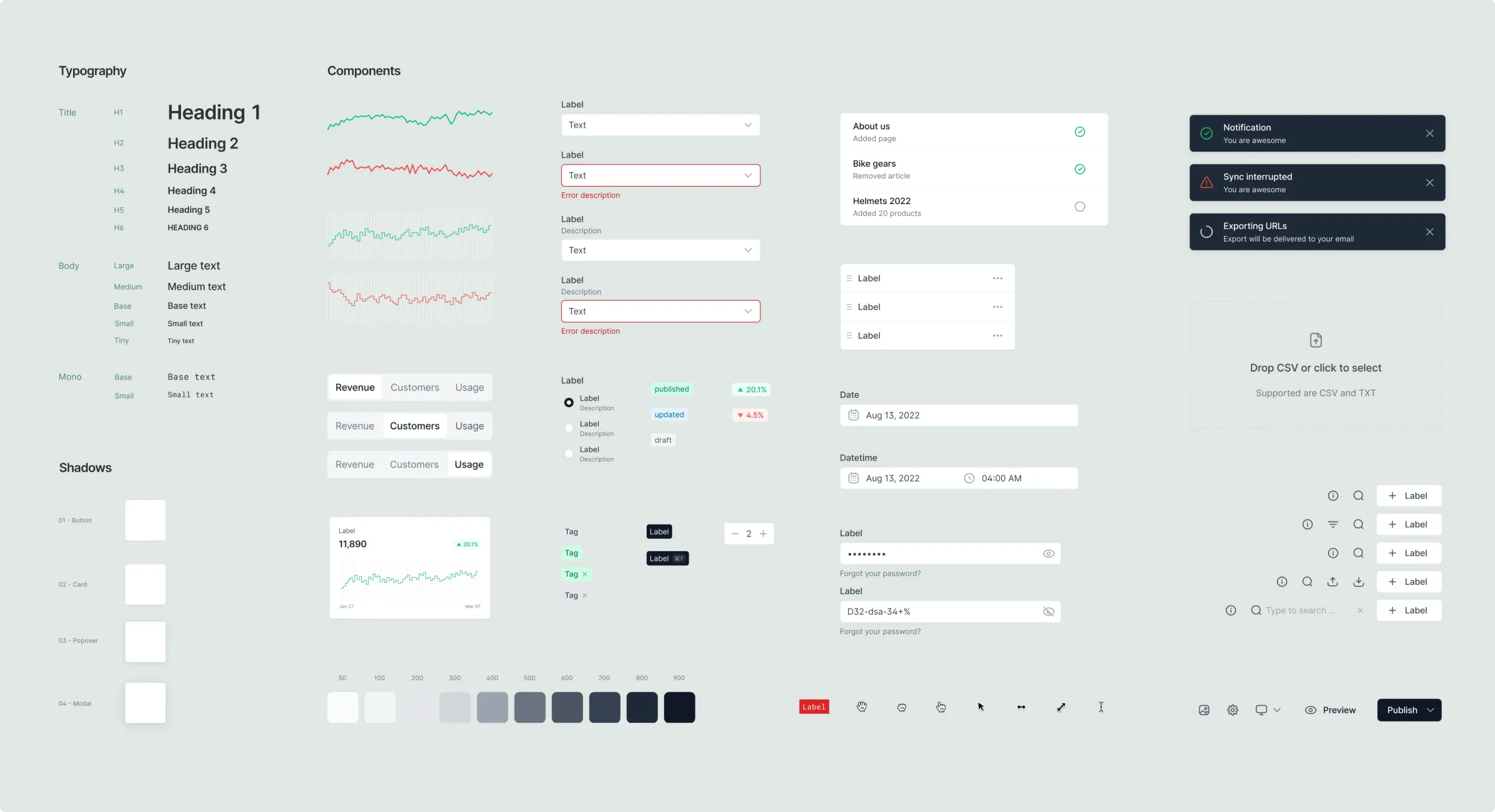
As Pack grew more complex, its design system hadn't kept pace. We rebuilt it from the ground up: a custom iconography library, a refreshed color palette, bold lifestyle photography, and a new set of UI components, each considered for its own use case, flexibility, and reuse across the platform. The goal was one cohesive kit that could extend to every touchpoint as the product kept growing.
"The new Pack platform gives brands and agencies powerful front‑end tools to communicate with customers more easily. We're incredibly proud of Nessa's design work. Collaborating with their team allowed us to simplify the headless build process into a cutting edge software product designed for brand operators and developers."Cory Cummings, CEO at Pack
More work