Case Study
Designing an exclusive investment app for accredited investors.
Challenge
Parri Passu Venture Partners backs early-stage eCommerce and SaaS founders, and wanted to give its own investors something rare: direct access to the kind of exclusive deal flow usually reserved for firms like Sequoia, Sierra, and Upfront. The plan was a members-only mobile app, invite-only from the first screen, built specifically for accredited investors.
The hard part wasn't any single screen, it was the tone. Every part of the app, from the sign-up flow to how a deal gets published, had to feel as selective and considered as the fund itself. A generic fintech UI would have undercut the entire pitch.
I led design on the platform end to end: the investor-facing app, the design system underneath it, and the internal admin tools the PPVP team uses to actually run it.
Approach
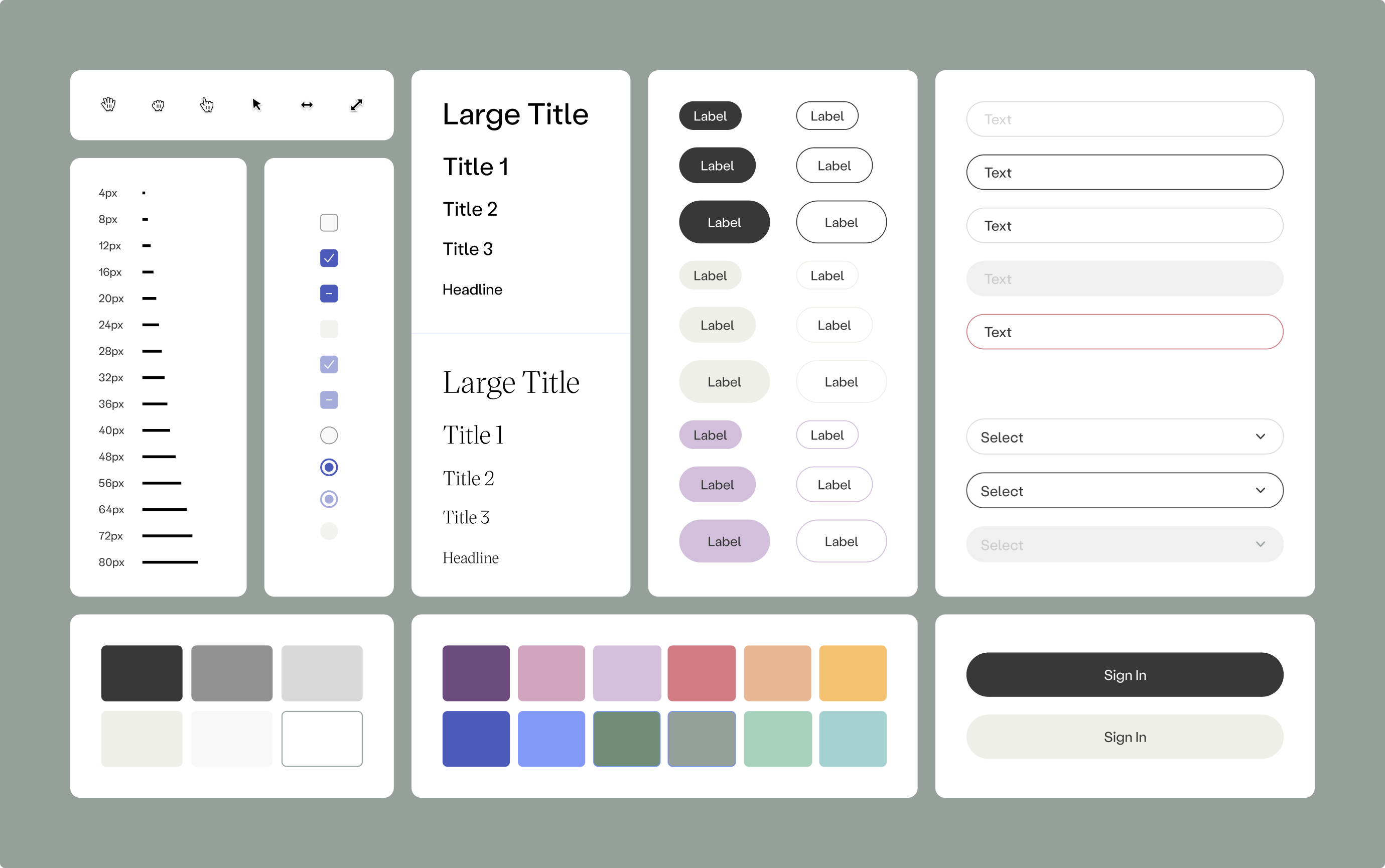
Since exclusivity was the entire selling point, I started with the design system rather than any one flow: a restrained, editorial type system and a quiet color palette that read as premium on sight, not after ten minutes of use. Everything downstream, sign-up, onboarding, the deal feed, the admin panel, had to inherit that same tone so the app never broke character between an investor's first tap and a deal closing.
Solution
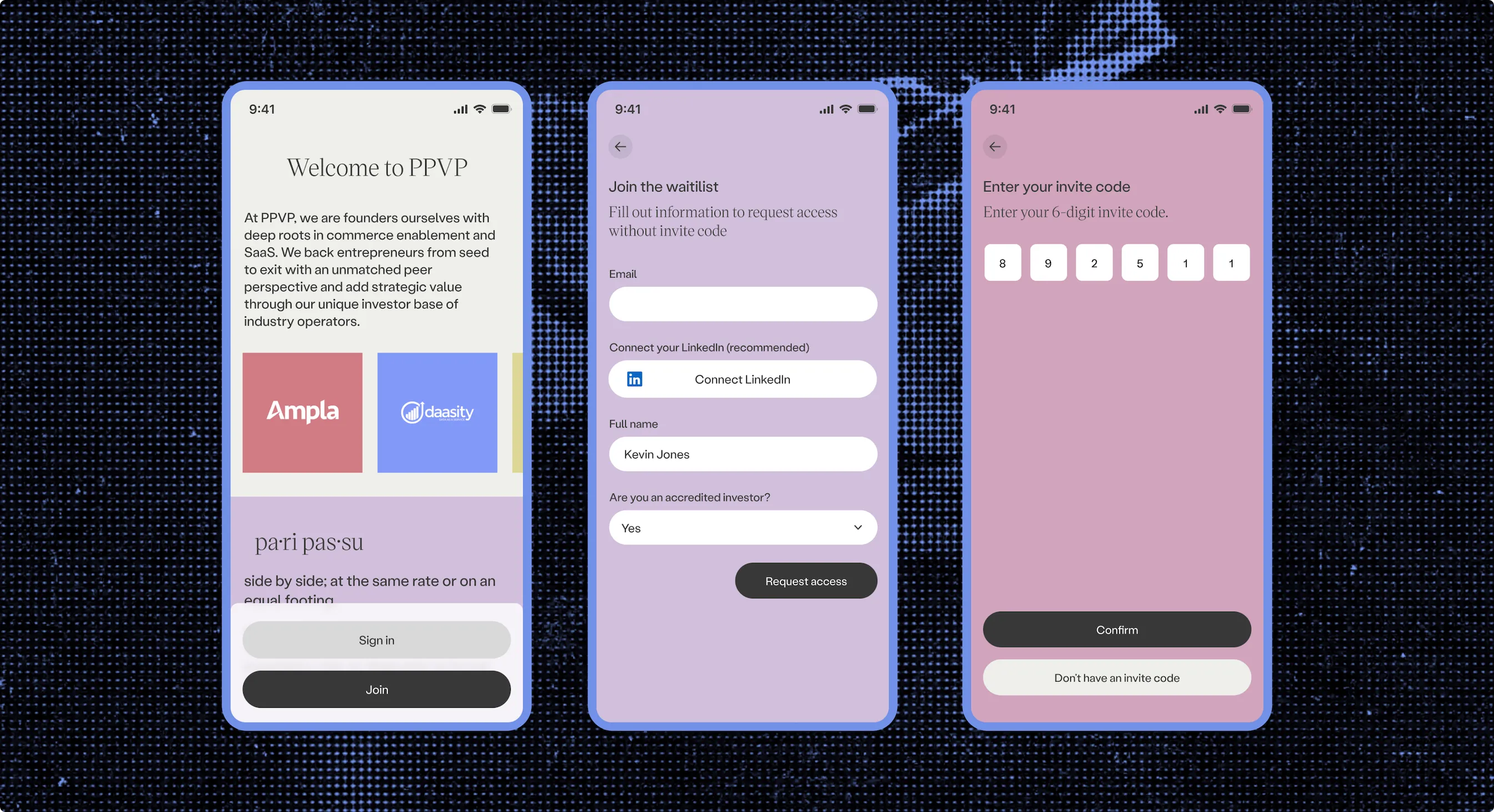
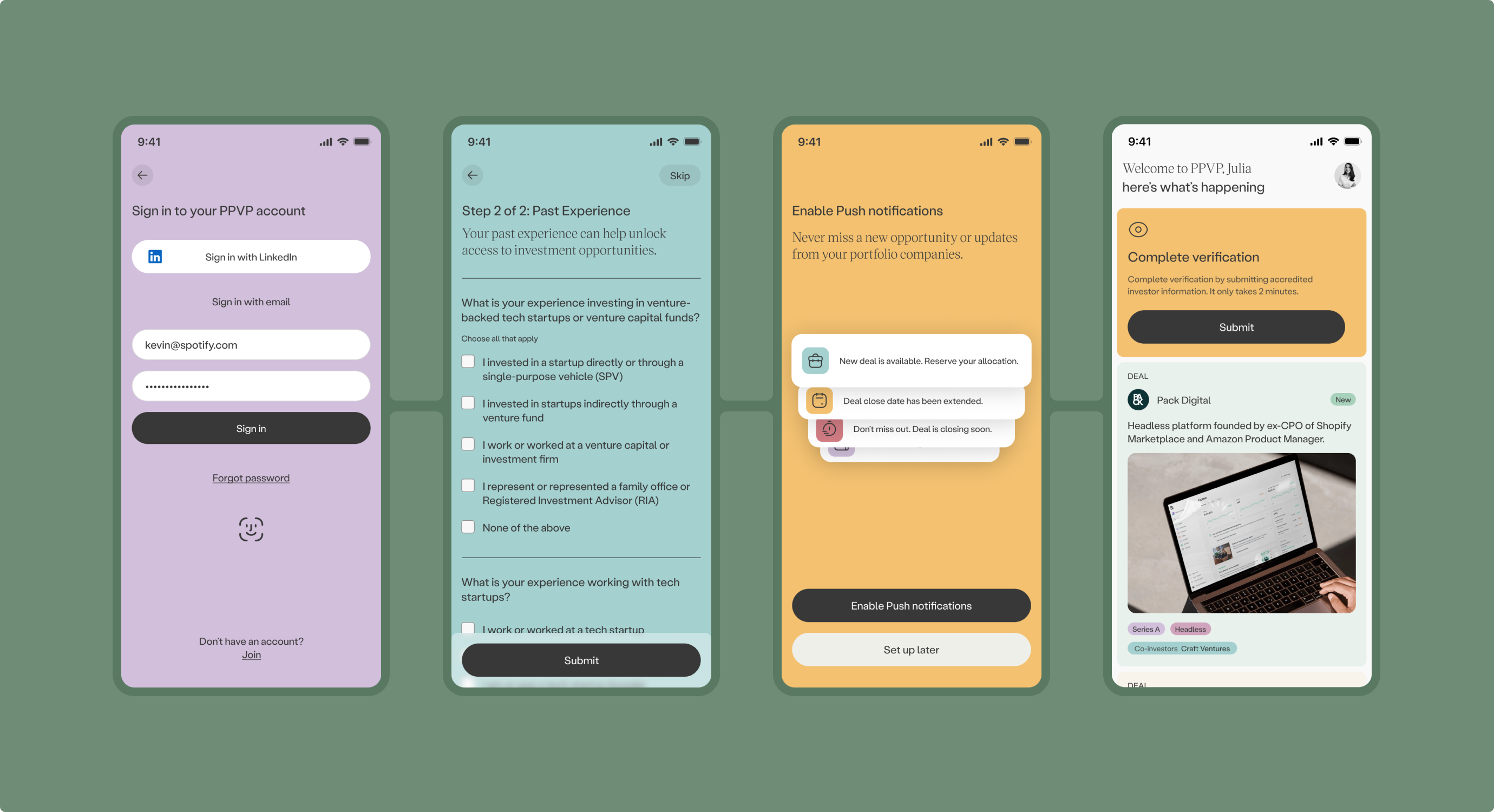
Sign-up was invite-only by design, gated behind a 6-digit code, FaceID, and a direct LinkedIn import so a profile could be verified without a pile of manual fields. Anyone without a code could still request access, but the default path was always: you're here because someone let you in.
Once inside, a short set of guided onboarding questions asked about an investor's past experience with venture deals before they ever saw an opportunity. That context mattered more than any single UI decision, it's what let the feed personalize itself from day one instead of showing every investor the same generic list.
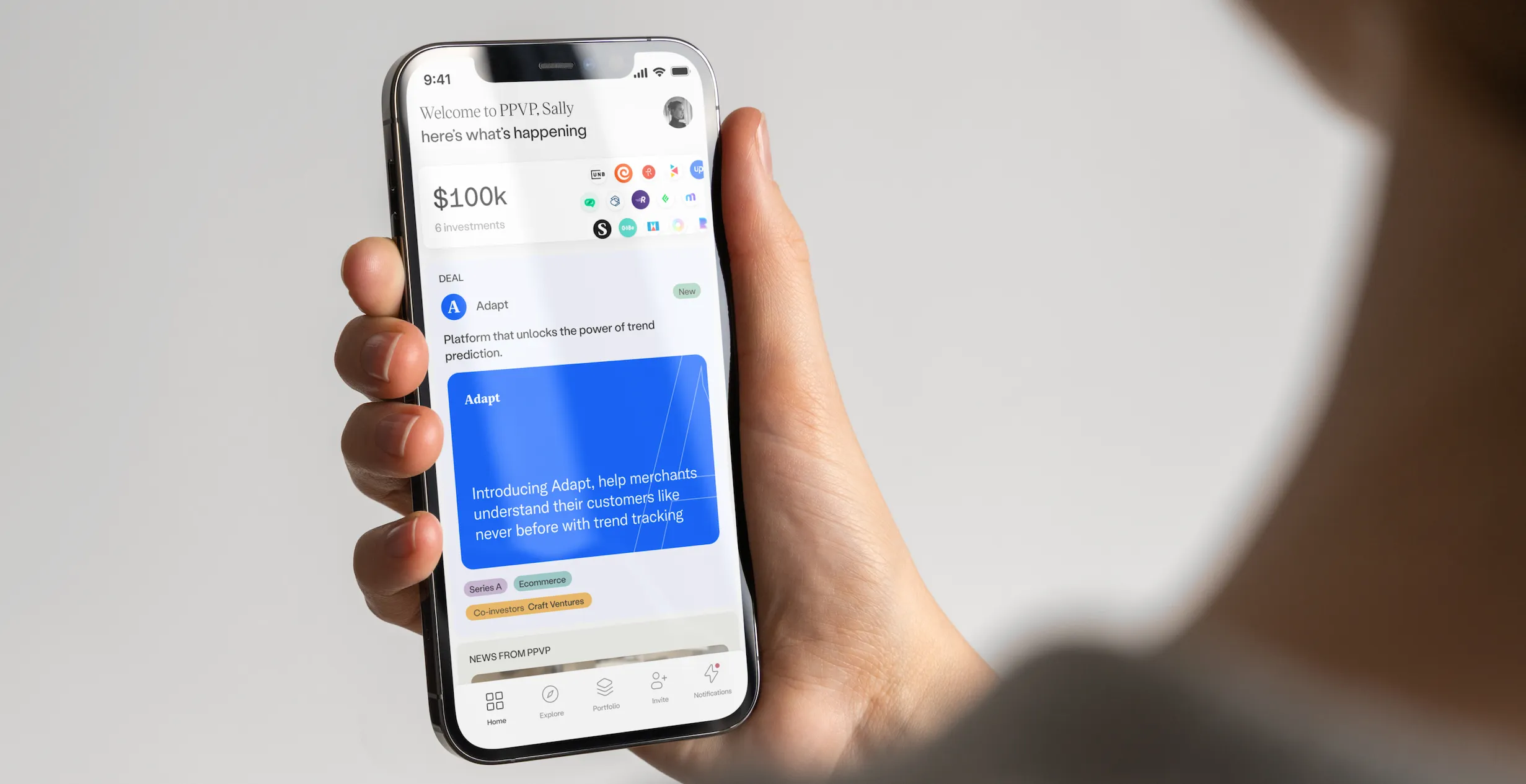
The home screen had one job: surface the right thing at the right moment without turning into a wall of charts. A portfolio summary sits at the top, followed by a single curated feed mixing new deals, company updates, and notes from the PPVP team, ordered by what actually needs an investor's attention rather than by section.
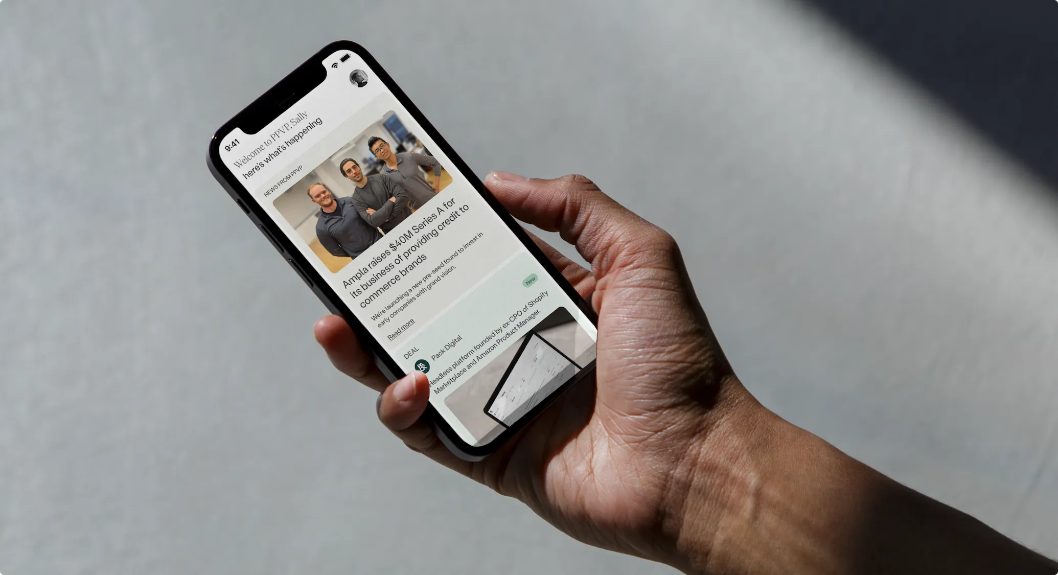
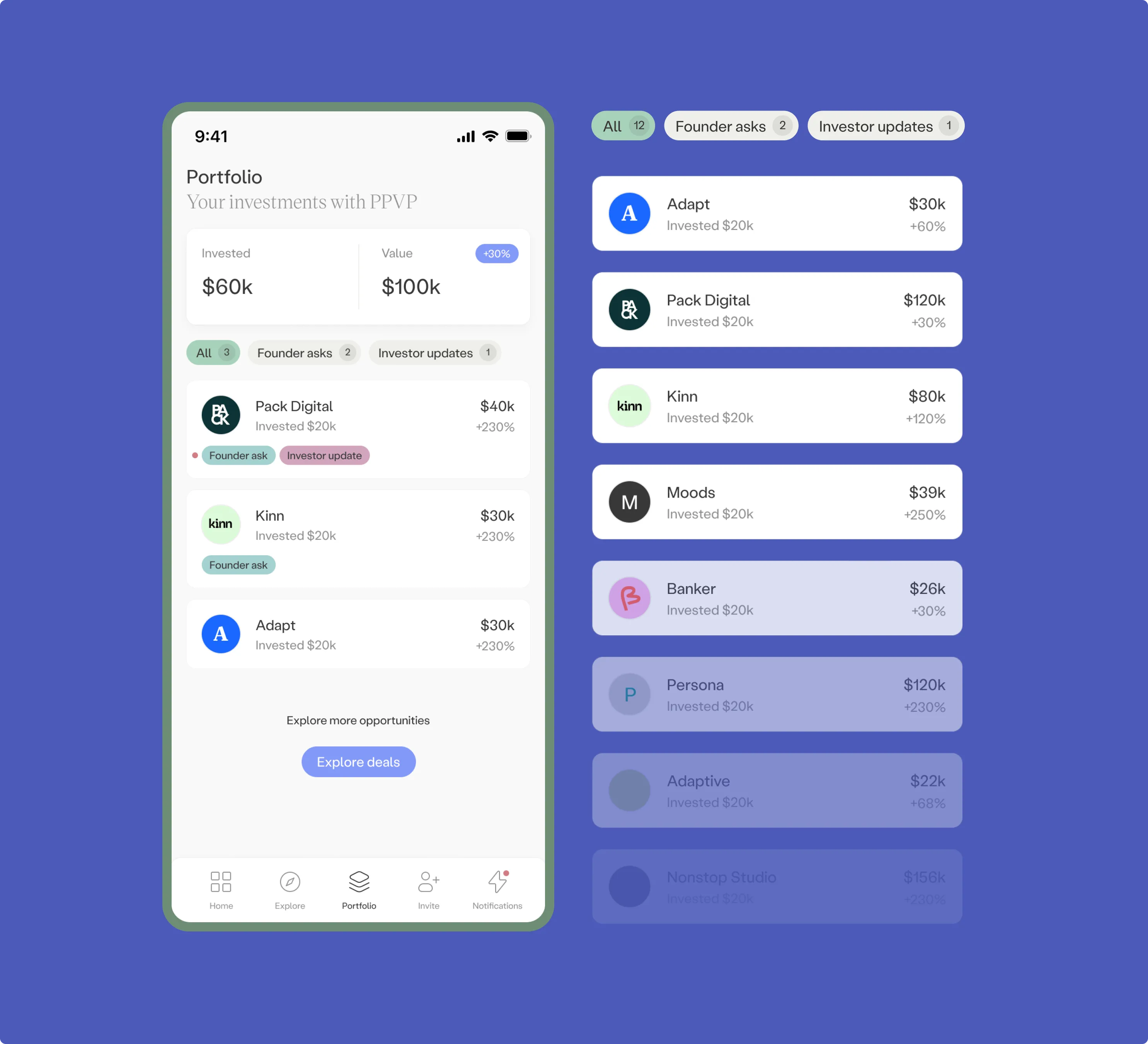
Discovery and portfolio tracking were deliberately split into two tabs instead of one crowded view: Explore for new deals available to members, and Portfolio for tracking what an investor already has money in. Opening a deal from either one leads to the same detail view, terms, pitch deck, memos, so requesting an allocation is a couple of taps, not a phone call.
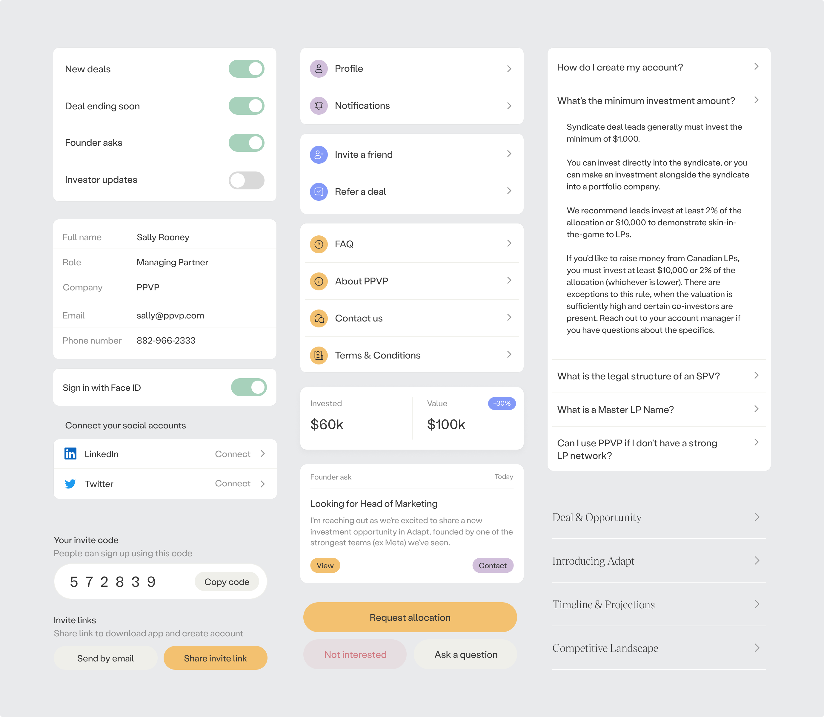
PPVP's team was always going to keep adding features after launch, so the interface kit was built as a real system, not a one-off screen library: form fields, buttons, cards, and interaction patterns that could be recombined without a designer in the room every time. The same deal template reused across mobile and desktop contexts is a small example of the bigger idea, one component, built once, holding up everywhere it's needed.
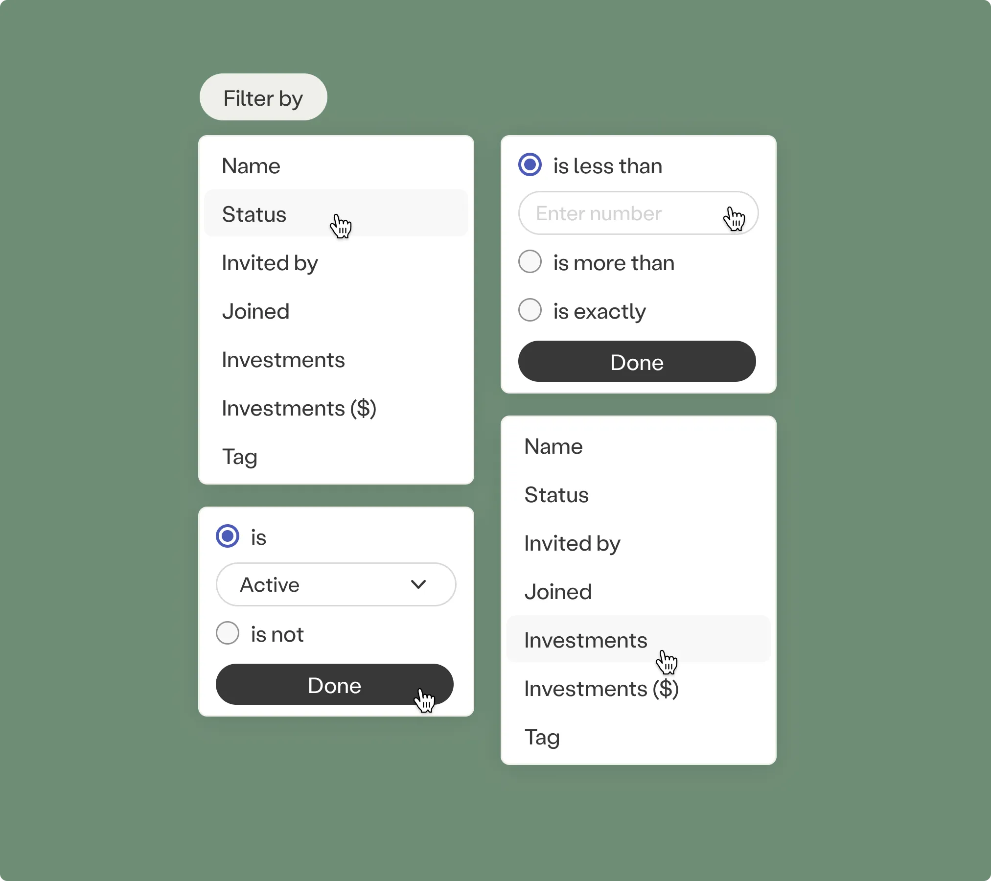
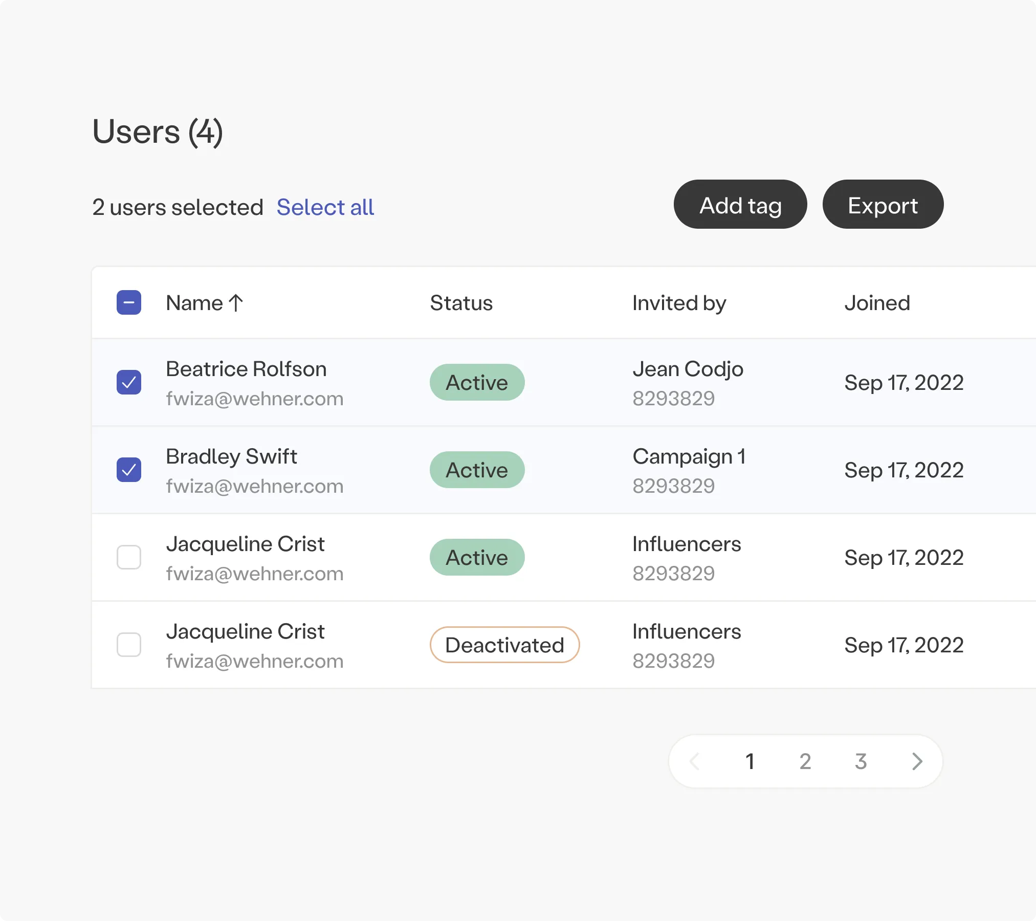
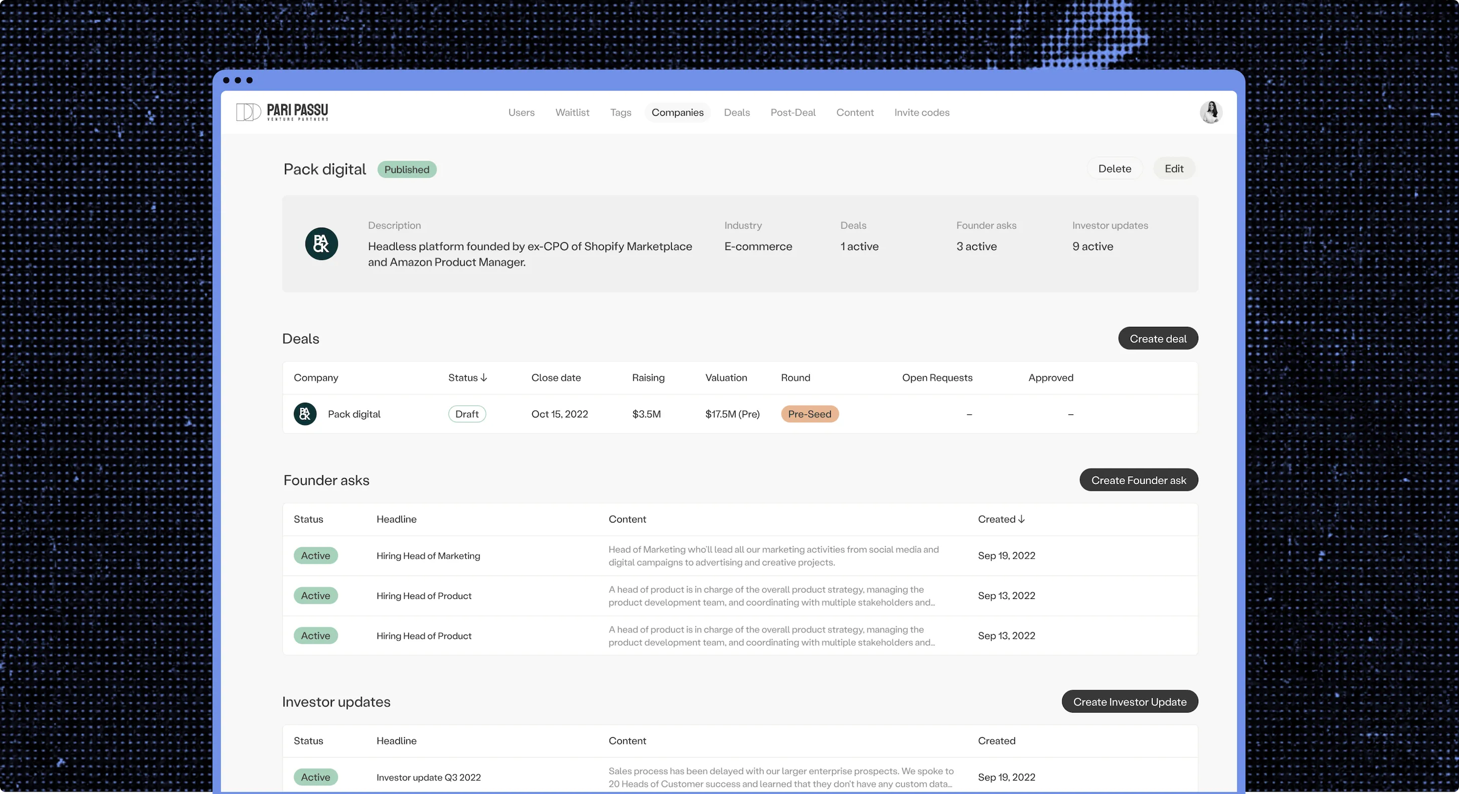
Behind the investor app is an admin panel that's part CMS, part user-privilege system. The PPVP team publishes new deals, edits terms and closing dates, manages investor profiles and invitations, and pushes updates straight to the feed, all through the same simple form fields, so getting a deal live never depends on an engineer being free.
"Nessa has done an incredible job from a design standpoint, providing us with unique and innovative designs that are rooted in research, not just aesthetics. We've also enjoyed working with their team; they feel like a true partner."Julia Gudish Krieger, Managing Partner at PPVP
More work